The Role of Colors in Takeaway Packaging: Boosting Appetite and Brand Identity
By Anttoni Taimela · 25. April 2024
In the competitive world of food takeout, the role of colors🎨 in takeaway packaging cannot be overstated.
From the bold red that stirs hunger to the green that conveys freshness, the right color palette can be crucial in influencing customer choices.
This article laser-focuses on the strategic use of color in packaging, examining how it affects consumer preference and stands as a critical component of a brand’s visual identity.
The Impact of Colors on Consumer Behavior
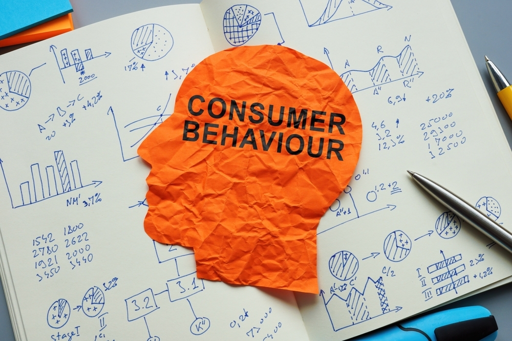
 Consumer Behavior
Color, a seemingly innocent attribute of our everyday life, holds a significant sway over our consumer behavior.
It’s often the first thing that grabs our attention when looking at a product, even before we take into account any textual or graphic content.
It’s no wonder that savvy businesses are learning to colour cautiously, using it as a tool to create emotional connections with customers that can effectively influence their decision-making processes.
The impact of color goes beyond just grabbing attention; it plays a crucial role in perceived fluency, where visually easy-to-process products are preferred.
Warm colors like red🔴 and yellow are especially impactful in this context. Red excites and stimulates, heightening nerve impulses and increasing appetite, leading to an escalation in purchasing decisions.
Yellow, processed quickly by the human brain, supports the appeal of warm colors in attracting consumer attention and enhancing appetite.
These warm colors are associated with the tastiness of food, potentially linked to an innate preference for ripe, sweet foods.
However, as with everything, balance is key. Overuse of a singular color in retail can lead to consumer avoidance and negatively impact the likelihood of return visits.
So, while warm colors in packaging significantly increase the purchase intention for foods seen as indulgent, cool colors do so for healthful foods.
It’s a colorful dance of attracting and engaging consumers in a way that resonates with their subconscious preferences.
Color Psychology in Takeaway Packaging
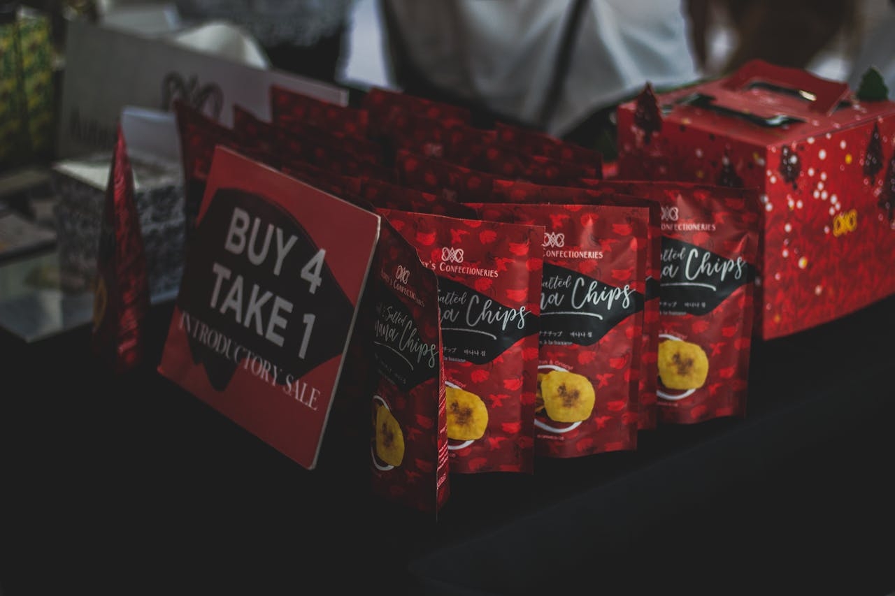
 branded food packaging
Translating this understanding of color psychology to the realm of takeaway packaging, we realize the potential to significantly influence consumer perception of food quality and taste, while also helping to establish a recognizable brand identity.
The colors used play a crucial role in conveying the brand’s image and making the food more appealing. For example, blue evokes a sense of fun, trust, and dependability among consumers despite often being used for foods unrelated to the color itself like chocolate chip cookies.
Other colors also carry unique connotations. Purple exudes an aura of elitism, luxury, and lavishness, often used in packaging to suggest premium quality and associated with the flavors of berries, acai, and grapes.
On the other hand, brown on food packaging conveys an alternative, rich, intense, and earthy quality, which may be leveraged to suggest a more artisanal or authentic experience.
But let’s dig deeper into how specific colors play out in takeaway packaging, starting with the fiery red.
Red: Excitement and Hunger
Ever wondered why so many fast food restaurants, including Burger King, use red in their branding? Think McDonald’s, KFC, Wendy’s, and Chick-fil-A.
The color red is no random choice. It stimulates and excites, is associated with passion and love, and hints at sweetness, enhancing appetite when used in product packaging.
This power of red to ignite excitement, stimulate appetite, and leave customers eager for the product makes it a popular choice in takeaway packaging.
But red’s power can be like a wild horse, needing careful harnessing to avoid overwhelming the customer.
To moderate the intense impact of red, it is often balanced with white in design, helping to calm the overall packaging appearance while maintaining its effectiveness.
The success of this color strategy is confirmed by the fact that successful🏆 fast-food chains like:
- KFC
- Wendy’s
- Chick-fil-A
- Tim Hortons
use red prominently in their packaging, corroborating the color’s impact on consumer behavior.
Yellow: Optimism and Energy
Next up is yellow, the color of sunshine and happiness. In food packaging, yellow⭐ is perceived by the brain in a way that promotes optimism, excitement, and stimulates the appetite.
This makes it a popular choice for fast-food brands that want to convey a sense of fun and energy to their customers.
But remember to colour cautiously. While yellow is bright and cheerful, it needs to be used strategically to avoid overwhelming the customer and ensure it aligns with the brand’s overall image and message.
So, whether you’re packaging a juicy burger or a healthy salad, consider how the color yellow could enhance the customer’s dining experience.
Green: Health and Sustainability
Green🟢, the color of nature and health, has a special place in the world of takeaway packaging.
The color green in packaging psychology represents good health and well-being.
This makes it an excellent choice for brands that want to convey a focus on health and sustainability.
Take Subway, for instance. The fast-food chain incorporates green across their takeaway packaging to highlight their focus on health and fresh ingredients.
Moreover, green in takeaway packaging underscores a commitment to sustainability and indicates the presence of natural products.
So, if your brand values align with health and sustainability, green might just be the color for you!
Harnessing Color Combinations for Effective Branding
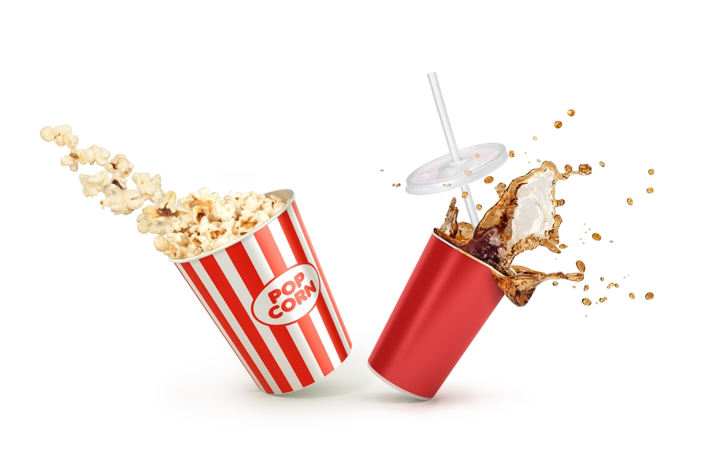
 red paper cup and food paper
While single colors can convey powerful messages, the magic happens when we start combining them.
Colorful advertisements are engaged with up to 42% more than black and white ones, showcasing the importance of using vibrant colors in packaging to attract consumers.
Strategic color combinations, informed by the color wheel and concepts like complementary colors, can animate designs and accurately communicate a brand’s message.
The choice of colors and printing methods, such as CMYK or Pantone, can have a substantial visual impact on packaging, enhancing food quality perception and consumer engagement.
Colors can subtly evoke emotions, affecting both marketing strategies and consumer decisions, with warm colors inducing excitement and cool colors promoting a sense of calm.
Sustainable Practices and Eco-Friendly Takeaway Packaging
In today’s increasingly environmentally conscious world, the packaging isn’t just about aesthetics and brand identity; it’s also about sustainability.
Over half of consumers are concerned about the environmental impact of food packaging, and two-thirds are willing to pay more for sustainably packaged foods.
Furthermore, over 80% of consumers are demanding the use of sustainable packaging materials for the majority of products as of January 2023.
This shift towards sustainability and waste reduction is evident in the food industry with the adoption of eco-friendly packaging options like biodegradable, compostable, and recyclable materials.
Many food businesses have switched to materials like bagasse paper, mushroom containers, and polylactic acid (PLA) for more sustainable packaging.
Earthy tones like brown and gray in packaging communicate warmth and wholesomeness, suitable for sustainable🌱 and eco-friendly food products.
Customizing Takeaway Packaging for Different Food Products
Customizing takeaway packaging isn’t a one-size-fits-all approach. It involves balancing aesthetic appeal with functionality, providing a higher-end look for premium offerings and ensuring cleanliness for products like popcorn and chips.
Functional design details, such as built-in utensils or compartments, offer practical solutions that enhance the convenience and experience of takeaway food dining.
Personalized food packaging can be optimized through the use of:
- Online tools for both cost-effectiveness and branding
- Slot gift boxes and extensive ribbon collections that allow custom colors that align with brand identity
- Colors like blue to signal specific food qualities such as low-calorie options
- Cost-effective material choices that focus on features like oil and grease resistance, heat insulation, and safety for freezer and microwave use to maintain quality and prolong freshness.
Creating a Cohesive Brand Identity Through Color
With the power of color in shaping customer perception and influencing purchasing decisions, it’s clear that consistent use of colors across all media can strengthen brand recognition.
This is crucial in establishing a cohesive brand identity. After defining a brand’s identity and personality, the choice of brand colors must align with the desired message and feelings the brand aims to convey to its target market.
Takeaway packaging often provides the initial interaction between the consumer and the brand, presenting an opportunity to establish the brand’s voice and visual identity through branded packaging.
This can help elevate a brand’s image, ensuring a standout customer experience against competitors, incorporate elements that encourage digital engagement within packaging design, and extend the customer’s brand experience beyond the point of sale, fostering greater brand loyalty.
So, when it comes to creating a cohesive brand identity through color, remember, it’s not just about the packaging, but the entire brand experience, which contributes to the overall brand image.
Tips for Choosing the Right Colors for Your Takeaway Packaging
Choosing the right colors for your takeaway packaging can be a daunting task, but it doesn’t have to be.
One tip is to consider your brand’s image and the message you want to convey. For example, choosing an orange color for takeaway packaging implies fun and friendliness, which can attract customers and foster positive customer relationships aligning with a brand’s image.
User-friendly online tools that offer free quotes and downloadable templates facilitate the ordering of personalized food packaging, making it easier for businesses to integrate specific colors that reflect their brand and enhance the dining experience.
So, whether you’re a small business just starting out or an established brand looking to revamp your packaging, remember to colour cautiously, keeping in mind your target audience and the message you want to convey.
Frequently Asked Questions
How does color influence consumer behavior?
Color influences consumer behavior by grabbing attention, creating emotional connections, and shaping purchasing decisions. For instance, warm colors like red and yellow can stimulate appetite and increase purchase intentions.
What do different colors mean in takeaway packaging?
In takeaway packaging, colors can evoke specific emotions and associations. For example, red is associated with excitement and hunger, yellow promotes optimism and energy, and green represents health and sustainability.
How important is sustainable packaging?
Sustainable packaging is crucial in today’s world as more consumers are willing to pay extra for environmentally friendly options.
How can color help create a cohesive brand identity?
Using consistent colors across all media, including takeaway packaging, can strengthen brand recognition and establish a cohesive brand identity.

