13 Fabulous Ice-Cream Tub Designs
By Laura Gravesen · 2. February 2021
Our Ice-Cream Tubs
The growing demand for buying locally made products is a huge opportunity for smaller ice cream stores to expand and sell their products in retail stores, online or just in your shop for your customers to take it home and keep it in the freezer for a special day. So if you are looking to expand your product range or where your products are sold, then we have collected some of the best designs of ice cream containers with lids below, that are sold to be used for freezing down the products.
Before digging into all of the designs, it is important to know that the tubs that you see down below can be used for more than only ice cream, it can be used for anything that you want to freeze down. The containers and lids can be printed all-over in all the colours you want, which is also why you will see some creative designs that have a lot of elements.
Some of the designs have been outlined and described. We have to remember when looking at different designs, that there are no correct answers – everything depends on the case and business that needs to express them and their product.
Eis Bar Roma
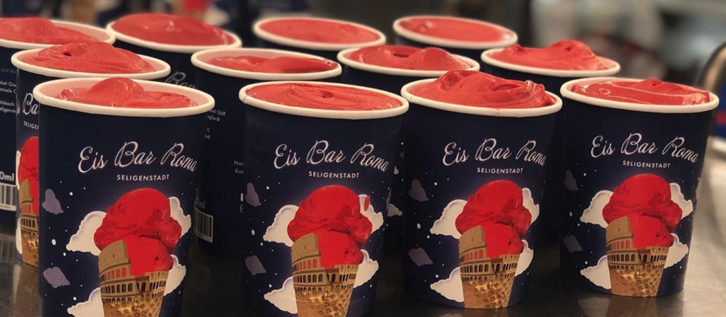
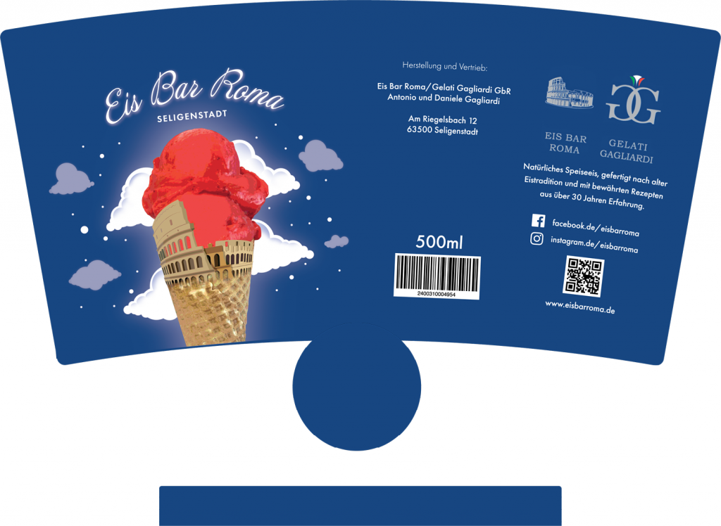
Eis Bar Roma is an ice cream shop in Germany that was started by some Italian owners that wanted to bring and tell the story about how ice cream is made in Rome. They have been doing this for a long time from their ice cream shop, but they are now starting to sell their ice cream in retail stores, which is the reason for the barcode on their cup.
The story behind their brand is also reflected perfectly with the ice cream cone that turns into the colosseum and of course ice cream coming up of it. I think it is genius to use the ice cream cups to tell the story of the ice cream that the customer is eating.
BrainEffect
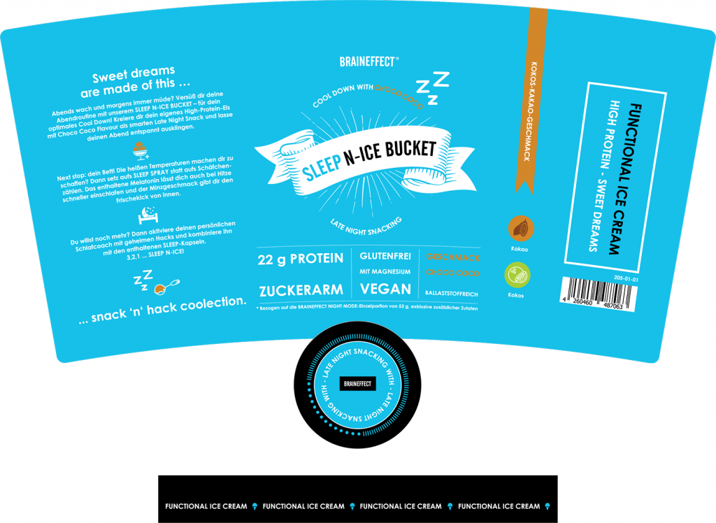
The reason why BrainEffect is in this article about giving inspiration is because of what they are using the ice cream containers for. Since they are using them for something completely different than the rest of the companies that we are going to have a look at. They actually make a kit where you are able to make your own ice cream and freeze it down, so you can eat it whenever you want.
They also state that in their design, where the process is described on the left side – and the primary focus of the ice cream is to make you sleep better – which is why this statement is stated all over the cups.
Thaller-Eis
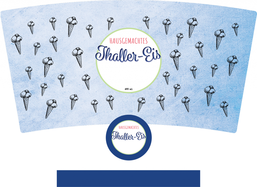
Thaller-Eis is a German ice cream store that makes their own ice cream. The design for their ice cream cups is that they are trying to show that they do Ice cream with all the small ice cream elements in their designs. It completely makes sense, since we all can imagine that the ice looks like the first ice cream that we are looking forward to getting every summer.
Furthermore then in the middle where they have their logo – they are stating that the ice cream is homemade. But under the logo they have also made room for a sticker, so that they can put a sticker on the cup to tell the customer which taste it contains.
Nicecream
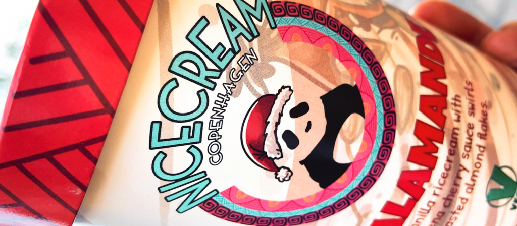
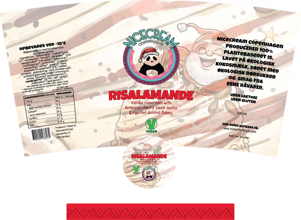
Nicecream is a Danish ice cream brand that both have their own stores and sell in retail stores, and each year they produce a Christmas version of their vegan ice cream. They put their heart and soul into making sure that their customers understand that this version is only launched in the winter months, whereas the rest of their 6 different ice cream collections you can get that all year long.
I think this ice cream tub design can be used for some great inspiration to help you differentiate a version of your ice cream that is only available under certain circumstances.
Click’n’Lick
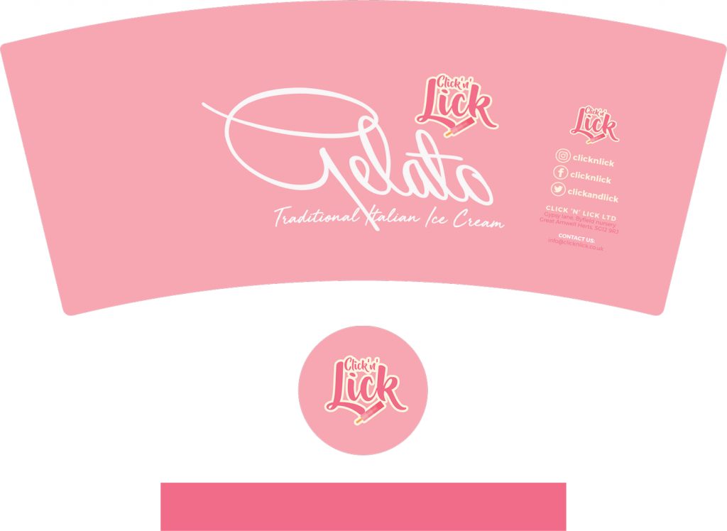
Click’n’Lick is an ice cream store in the UK where the customers are able to build their own box with different tastes and kinds of ice cream. They wanted their customers to be able to choose some of their own ice cream to get in these boxes, and since they are also selling other brands of ice cream they wanted to make sure that the customers understood what ice cream they had made.
This is the reason why the containers are branded so heavily in their colours and their logo and name fills so much in the design.
Restaurante Stive
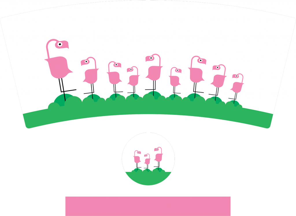
The design made for Restaurante Stive’s ice cream cups with lid are also a quite common example of how you can make the design while using illustrations from your logo. As you will quickly guess when seeing the design, their most important illustration is the Flamingo – which is why they have chosen to use it so actively in the design.
The clever strategy of using the flamingos so many times in the design, is that the customer in the future will think of Restaurante Stive when seeing flamingos instead of other things they might think a Flamingo represents.
Les Frères Amoré
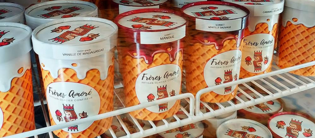
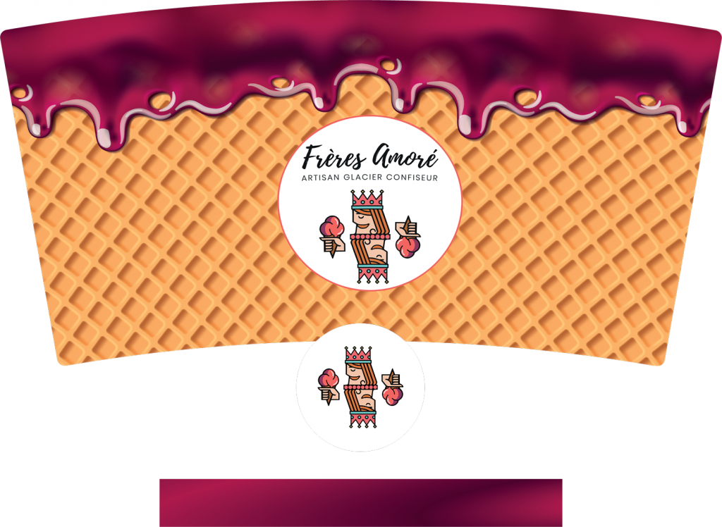
Les Frères Amoré is a small ice cream shop that is selling homemade ice cream in two stores but they also wanted to offer the possibility for customers to buy their ice cream and take it home and put it in their freezer.
They have chosen to have two different ice creams that they would like to offer to their customers – the way that they have chosen to differentiate the two tastes is via the lid and the colour in the top of the cup so it looks like the ice is melting. This is also why the rest of the cup is printed with the pattern of an ice cream cone – so the customers get the feeling of eating directly from the ice cream cone when leaving their store.
L’Artisan Chocolaté
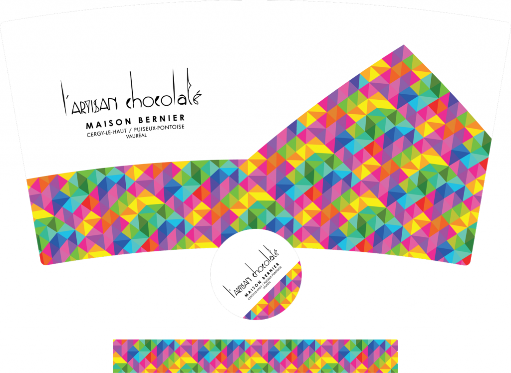
The reason why I wanted to show you these ice cream cups with lids, is not as much the story behind the cups – but more to show you the colour possibilities on the cups. Since the cups are printed with full colour print on white cardboard, you can get almost all colours that you want and as many as you like. This almost also describes the strategy that L’Artisan have been using when making the design for their ice cream containers.
FreezeBee
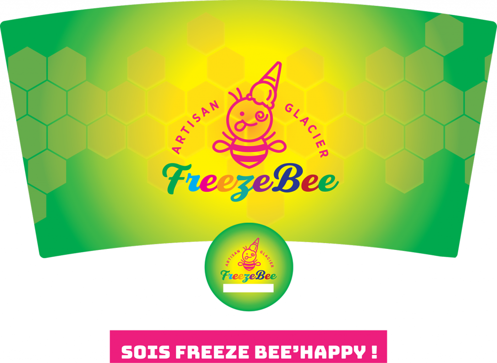
The design made by FreezeBee is in the same category as the design made by l’Artisan Chocolate, it is to give you some inspiration on how the colours can be used – and how we are able to fade the colours into each other. The design also shows how they use many colours both on the lids and on the cups, and how that both can be great in the design but also can be a bit confusing.
Les Saveurs d’Emeline
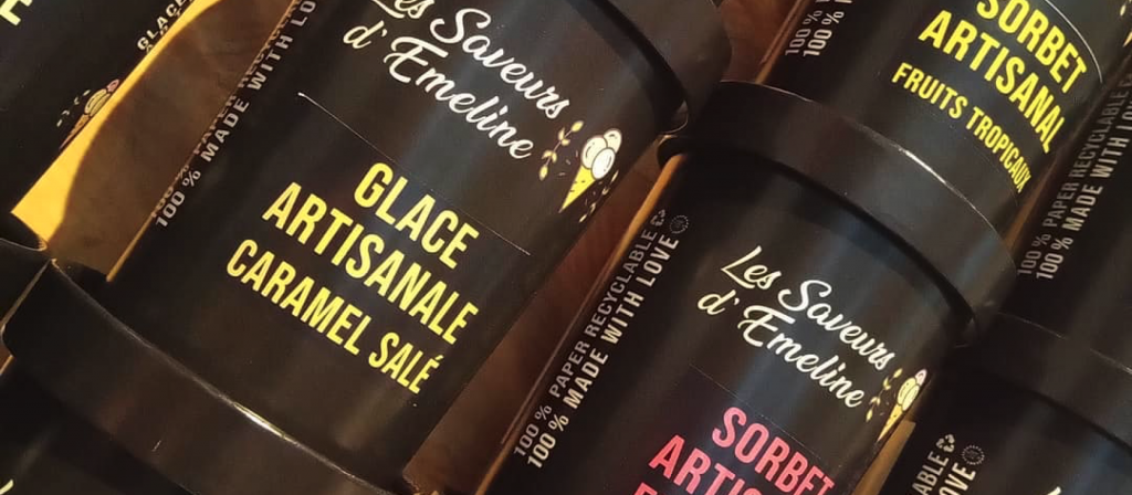
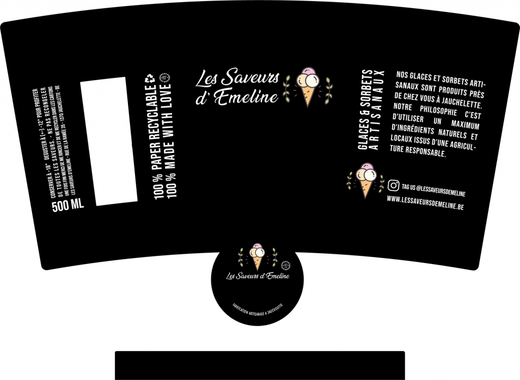
Les Saveurs d’Emeline is a Belgian store making different kinds of desserts such as ice cream. They do make ice cream with different flavours but they have chosen to have the same design on the cups for all of their flavours, and then they are instead using stickers to show the flavour and what the ice cream contains.
Using stickers to differentiate the flavours instead of designs does not bring the same consistency and the ice cream containers will not look as great – but if you are a small business who wants to test the concept of selling ice cream for your customers to bring them home, it is a cost effective way to test it with stickers instead of different designs.
Opal
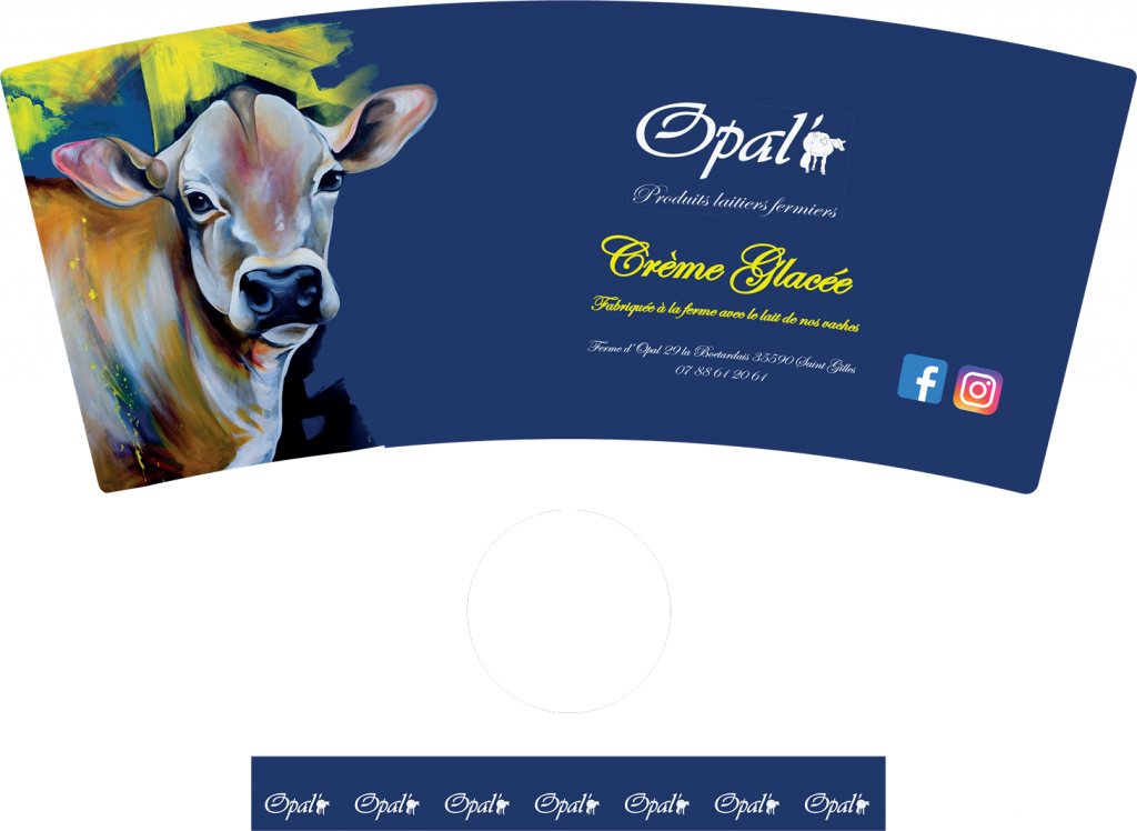
OPAL ice might have one of the more odd ice cream tub designs, but once you know the story of their brand then it all comes together – and then the design just adds to the story and gives that feeling when eating the ice cream. What is the story then?
The special thing about the OPAL ice cream is that they only use dairy products for their ice cream, and the milk and cream comes from local farms that make their dairy products organically. This is what the cow symbols and the experience that you get when you enter their store or eat their ice cream.
U Palazziu
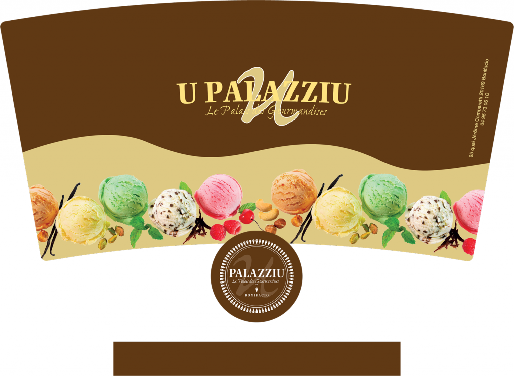
U Palazziu is a small ice cream shop in an area in France that depends largely on tourists and almost all their visitors are going to the beach to take a dip in the ocean. They do not make their own ice cream but they have still chosen to get ice cream cups with lids, to give their customers the possibility to bring their ice cream with them in a cooler bag and eat when they need it, so they don’t have to leave the beach to get great ice cream.
It is an easy trick to make sure that the customers who have been there once will keep coming back because it is such an easy solution for their customers. This is also the reason why their design contains so many different scoops.
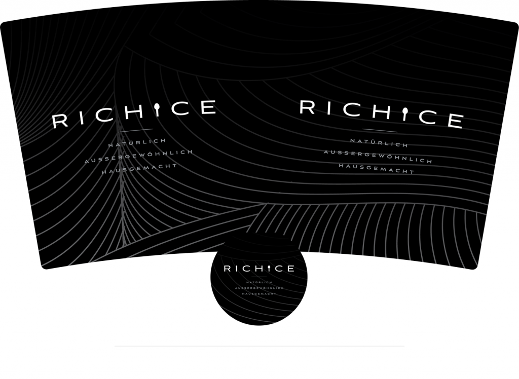
RichIce
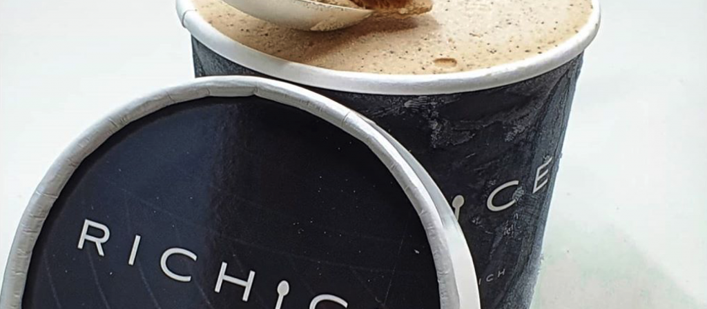
RichIce makes different kinds of ecological ice creams but since they are only selling them in their own store, they have made sure to only make one design for their ice cream. They have chosen to only have one design of their ice cream cups to make it easy to recognise, no matter what taste is in the containers.
The design they have on their cups is also rather simple, but the stripes that are fading on the top of the cups, makes the cups look very elegant due to the simplicity of the design.
